Web Trend Map 4
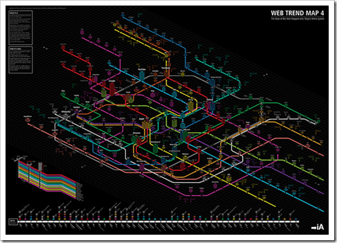
Mapping massive amounts of information into understandable structures, that’s what information architects do. There is a Japanese firm that does this very well: iA. They just released the 4th version of their Web Trend Map, and it’s (again) a pleasure to look at!

 See full size on Flickr. This time they were smart enough not to host it on own servers
 ![]()
The map maps all kinds of firms, services, social networks, .. that live on the web in a subway like structure. You have different lines, representing different focus domains. These focus areas may overlap in specific fields. Add to that the stability and the use, combined with some trend setters, and you know how complex this information is.
Learn more about it on webtrendsmap.com or even order a print. I’m sure some services are missing, and that’s why it’s kind of pity there is no interactive version of this. I would love to search, sort, highlight, filter, ..
For instance, I can’t find Netlog on the map (quite huge in Europe) and I’m pretty sure it was there on the previous version .. However I do find Skyrock, which is quite big but only in France. So probably Netlog is there, but I just can’t find it .. Who helps me out? ![]()
To finalize a little video they made to promote the map.
Enjoy!


Seriously: does this have *any* value at all beyond a perceived cool factor?
As a visualisation it fails (can’t find Netlog, what is the mening ot the “lines”), as a metaphor it fails miserably too (how exactly do web trends map on the Tokyo metro).
For the life of me, I don’t see what the annual hoopla is about.
It’s just nice and contains lot’s of information.
So depends on your definition of value I guess. Bu I like it, it values me!
BTW: the lines have value, they represent certain domains ..
Found Netlog in the publishing line: http://www.twitpic.com/8448s
Good catch