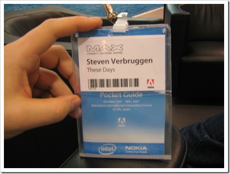
How to improve the MAX badge
As you can see on the photo the badge is rather big. I don’t mind: it holds a little booklet with the program, so you have that information close.
But that leaves a big area unused below your name. Some people use it for their business card, most people don’t.
Adobe nowadays has great looking logos/icons of their products. Little squares with (mostly) the product initials. They’re available as stickers (don’t know where to find them, not really a sway hunter) and people use them all the time to stick them on their laptops, t-shirts, body .. They’re basically tagging themselves. So it would be great that on registrations you’d get a sheet of stickers you could use to tag your badge. Tag yourself with the products your interested in. Or perhaps you can tick them at pre-registration on the website so they can be printed on your badge, might work as well. But stickers is cooler ![]()
Anyway, I think this would make networking even easier.
An other idea might be to print the badge in a specific colour to identify the country your from. This might help you to establish local connections.


hmmm Adobe Max, wish I was there… You bastard! :-p